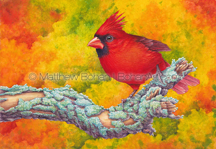
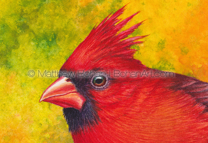
Everyone seems to like cardinals. I think the only time I wasn’t happy to see one was when I was birding in Hawaii, where they are an invasive species.
This was an unusual painting for me. Anyone looking at my portfolio will tell you that I love saturated colors and contrast. In almost all of my paintings there is some saturated color as well as some subdued color. In this painting I thought I’d try something different. Male Northern Cardinals are so outrageously colored, why not do a painting dominated by saturated colors? I chose a vivid fall foliage background with lots of yellows behind the bird and some reds in the background. I threw realistic colors out the window, rendering the branch dominated by purple tones and bragging up the blue-green lichens covering the branch. It was a fun experiment.
When I was in high school I wanted everything to be photographically realistic. With time I have found that less and less appealing. I’m drawn to images that have a literal look but but allow me to see the paint and some of the characteristics of the medium used to create it. I suppose that is why I’ve all but given up on the airbrush. I like the look of a hand-done wash.
I was reminded recently of my high school art teacher, Winona Yahn. She had the patience of a saint. I went to a small Catholic high school in southwestern New York. The place was run on a shoestring budget but managed to get an incredible amount done because of the efforts of people like Mrs. Yahn. From my understanding she volunteered her time to run an art program at the school. The necessary supplies always magically appeared for her classes. I’m sure she financed the majority of the program, and art supplies aren’t cheap. She had a great, subtle sense of humor and a high tolerance for the kids’ hijinks. Her job wasn’t easy. With her gentle nature, she tried to lead the kids by example. Some responded better than others. On her own time she painted a lot of well-received religious art.
I loved art class and would opt out of study hall whenever possible for an extra art class if she had one in session. At one point I had a rather large and elaborate pencil drawing of a huge, scaled, menacing dragon. It was standing on a landscape of carnage—dead knights, skeletons and skulls—with the dragon eviscerating one especially unlucky warrior. Behind it was burning castles, siege engines, gnarled dead trees and crows. A real upper! I did a dozen similar themed drawings like this. I was a teenage boy after all. Mrs Yahn came by, looked at the drawing, sighed and said, “Matt, I think you need to paint something happy. How about a smiling purple dragon for your next project?” I remember thinking she was nuts. I’m sure the disgust wasn’t well hidden on my face. But now, after more than 35 years, I see where she was coming from. She just didn’t have “Dude, lighten up!” in her vocabulary.
I might still have that drawing around here somewhere. At this point it would be totally embarrassing. I remember signing it with huge gothic calligraphy. Subtle! Looking back at my own efforts at that age, I’m pretty lenient when judging high school artists. Mrs. Yahn died last year; I never saw her after graduation. I’m not sure if she found out that I went on to make a living from art. It’s possible that she heard it from my dad, since we lived in a small town. I really appreciate all of her efforts for us, and it’s fun to look back at the people who guided us along the way.
Prints are available here.
 Transparent Watercolor and Time-lapse Video")


Rose Gatto
Love your cardinal
Matt
Thanks, Rose! It was a fun one to work on.
Stacey W.
I think this is my favorite of your pieces!
Matt
Thanks! This was a fun one to work on with all those saturated colors.