
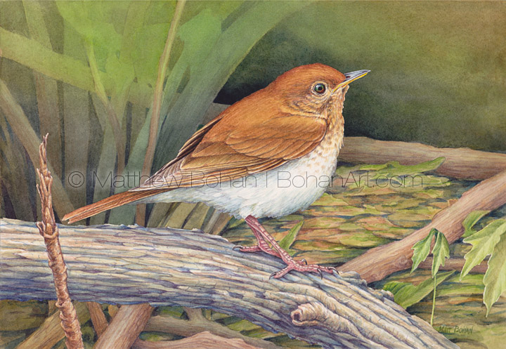
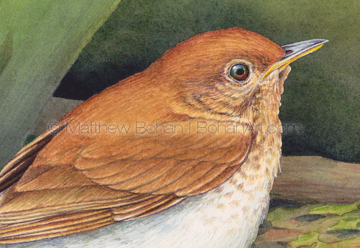
This Veery painting is another transparent watercolor on Arches 140lb Hot Press paper.
I’ve been teaching a watercolor course this year for a small group of homeschoolers. It’s been fun to watch the kids’ progress. They have produced a lot of great art of varied subject matter. It also has been interesting to me to have to verbalize things I’ve been doing subconsciously for 35-40 years. There is quite a bit of subtlety to how you hold a brush and use it that I didn’t think much about until seeing someone else try it and having to explain how to do it with greater precision.
Many fine artists look down on watercolors as being amateur materials, or a beginner’s medium. There definitely is a bias toward oils and acrylics in art schools and galleries. Sure, works on Belgian linen are going to hold up longer, but the majority of oils and acrylics are done on cheaply made pre-gessoed canvases on lousy stretchers and inexpensive canvas. I painted for years in acrylics and oils. I liked them, but they always lacked the luminescent, transparent qualities of watercolor. Neither of those “finer” media could offer the control I can get with watercolors.
For many watercolor is a frustrating medium. I’d be the first to agree that you have to play by the rules to have paintings work out well. The easiest things to do in oils and acrylics, like a completely even, flat application of a single color, can be confounding with watercolor. If you stick with it, watercolor’s idiosyncrasies start to get sorted out, and you’ll find a flexible and capable medium.
I think one of the things that thwarts many people’s attempts is using cheap paper. I’m fairly capable when it comes to the medium, and I don’t think I could get a satisfactory result on cheap paper. I initially learned watercolor from my mom. While painting in several different media over the years, she predominantly used watercolors. She ALWAYS used Arches 140 lb Cold Press (CP) paper. For years I followed her lead and used the same paper. The CP papers really drink up a wash well, making gradients and flat, even application of color easier. Cold press paper also stands up to re-working well, and the pigments seem to hold better and are less likely to lift.
As the years passed and I started developing my own style, I began to feel limited by all those annoying bumps in the CP paper. The tooth got in the way of the detail at times. When I was in graduate school for Medical Illustration, we had a watercolor course. To say that medical illustrators like detail is an huge understatement. I knew that using the usual CP paper was going to be too bumpy to allow for crisp detail. Wanting a really good grade, I ended up getting a sheet of Hot Press (HP) watercolor board and gave it a shot. I ended up doing an illustration of a bronchoscopy procedure and really liked working on the hot pressed surface despite some limitations. I ended up doing all of my projects for that class on Hot Press (HP).
Hot press paper is smooth, but it definitely doesn’t absorb a wash like CP paper. Unless you have a very gentle touch, the pigment can lift when glazing. That’s okay. It’s so smooth it allows for a ton of detail! I was converted. I’ve not bought cold pressed paper since.
For a while I bought blocks of 140lb paper made by Winsor and Newton called NCP (Not Cold Pressed). This was the Holy Grail of paper. It was almost as smooth as HP paper but took a wash perfectly like the CP paper. Alas, they stopped making it about a decade ago. Lana makes a nice HP paper that takes washes better than the Arches HP, but it doesn’t come in blocks. In the end I went back to the Arches 140lb HP paper blocks and had a bit of adapting to do. It definitely doesn’t take washes as evenly.
I have found that certain adaptations are necessary for Hot Pressed papers. Your technique has to be spot on, or you’re going to have uneven washes and lifted paints when glazing. This means you’re going to have to go through a certain amount of paper just getting your wash technique down. Practice!
Sometimes you need to approach things with 3-4 washes to build the tone you really want, especially for darker saturated colors. One pass doesn’t always cut it. I find the working time on HP paper is less than the CP paper. For HP paper you need to really follow the basic rules of watercolor to the letter. Always work light to dark. Always start wet and work toward drier, more opaque colors. You can get away with bending the rules a bit on CP paper, but if you stray on HP, you’ll be lifting colors and making a mess.


Leave a Reply