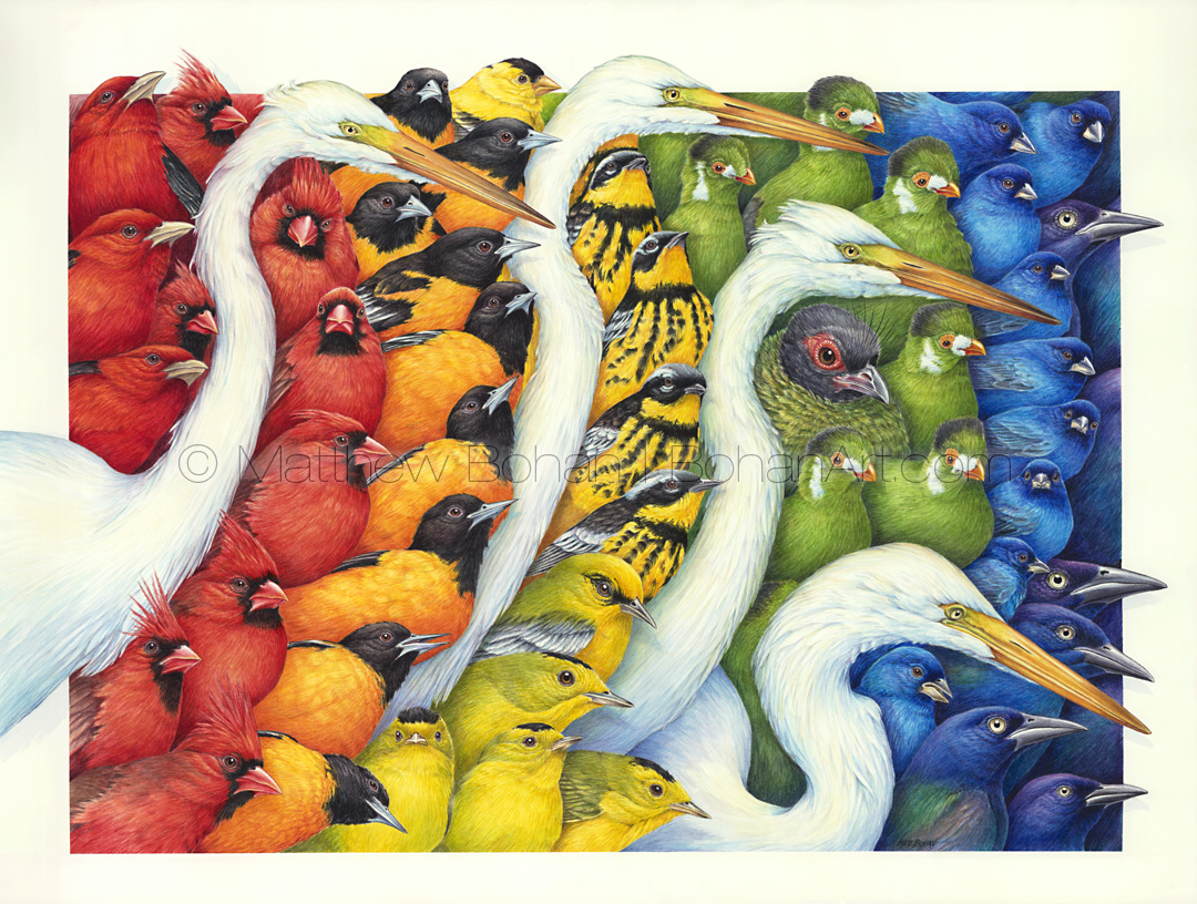
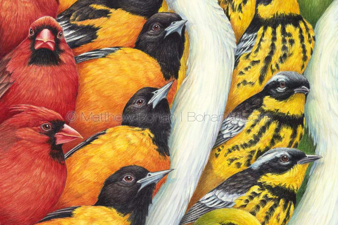
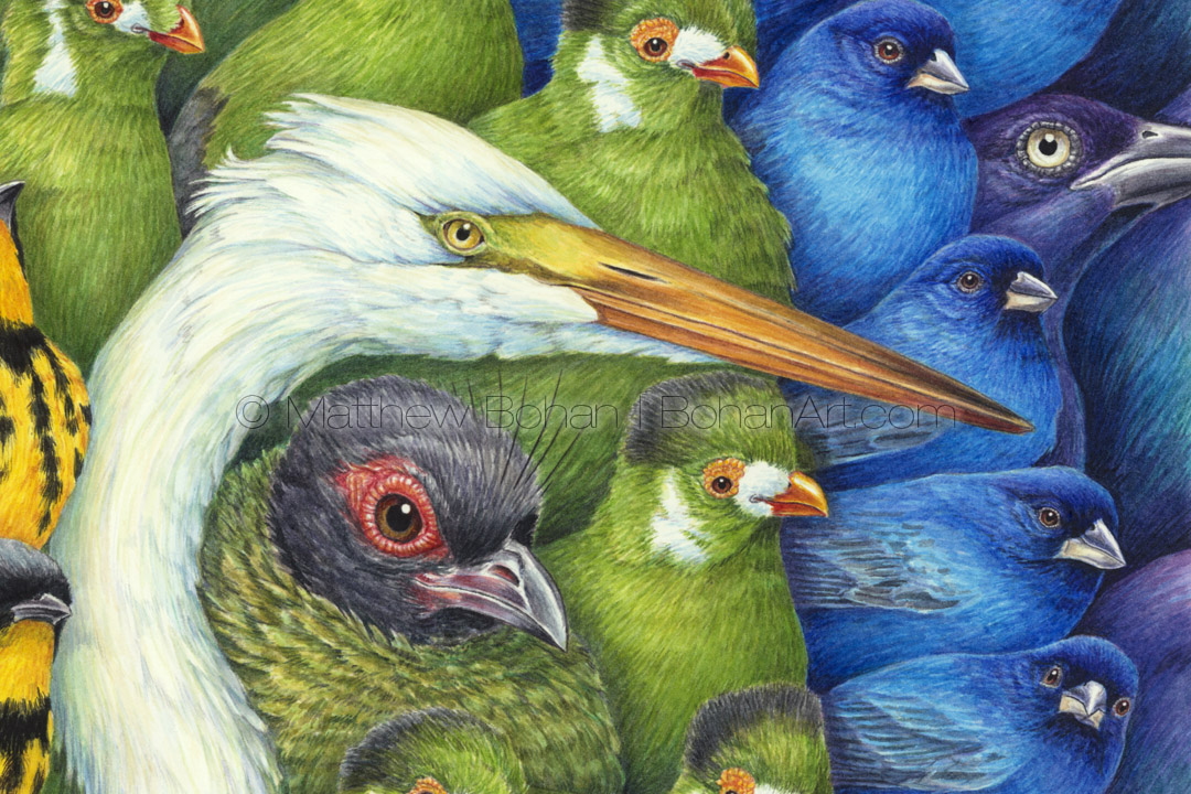
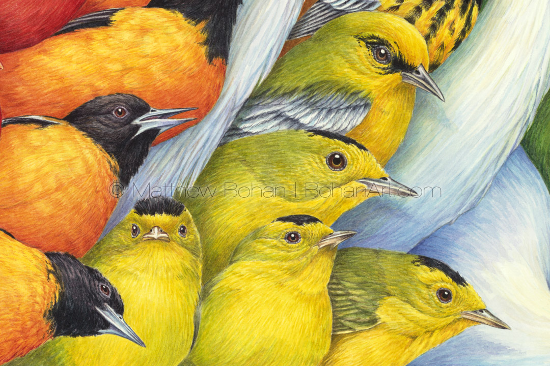
Flying Colors (Detail from 18×24-inch Transparent Watercolor on Arches 140lb HP Paper)Flying Colors (Detail from 18×24-inch Transparent Watercolor on Arches 140lb HP Paper)Flying Colors (Detail from 18×24-inch Transparent Watercolor on Arches 140lb HP Paper)Flying Colors (Detail from 18×24-inch Transparent Watercolor on Arches 140lb HP Paper)Flying Colors (Detail from 18×24-inch Transparent Watercolor on Arches 140lb HP Paper)
Well, I’ll cut to the chase. This 18 x 24-inch watercolor took an incredibly long time, somewhere in the 70- to 80-hour range, and it was one of the more complex paintings I’ve ever attempted.
There isn’t a lot of margin for error with a painting like this, because every square inch is covered with exhaustive detail. I’ve done a few works in the past similar to this one. Unless it’s a commissioned piece, when you undertake something on this scale, you’re in it for yourself. Like my crazy bird hats, the time investment alone prices the finished piece out of the range of most sane individuals. I’m not sure what that says about the sanity of the artist. Two of the other paintings like this are framed in our house; a third resides in a closet. Over the past 15 years I’ve moved to smaller, more traditional paintings of animals, allowing me to finish a greater number of paintings at a lower price point for potential buyers. For a while I’ve had the temptation to start this style again. Working on a bunch of Op Art projects got the gears turning on possible designs. I decided the time had come to investigate this style again, even if I ended up with something that wouldn’t sell.
When I was in art school, teachers seemed to celebrate post-abstract expressionism, and everything else was considered garbage. Pretty much anything that contained an animal became a lightning rod for the fine art crowd to voice their contempt. A bird might as well have been a crying clown, Elvis on velvet or dogs playing poker. On top of that, paintings and drawings done in a realistic or representational manner were quickly dismissed as “renderings” and definitely not considered fine art. At the same time, there seemed to be a high tolerance for portraits and nudes, which in my humble opinion have been “done to death.” Granted, I’ve seen so many hawk and eagle paintings (mostly bad) that I’ve only created one in the past 25 years. I typically shy away from ducks for the same reason. When designing a painting, I spend a lot of time considering composition, backgrounds, perches, colors, movement within the frame and how the viewer will work around the painting. I think all of this puts them beyond being “just” illustrations.
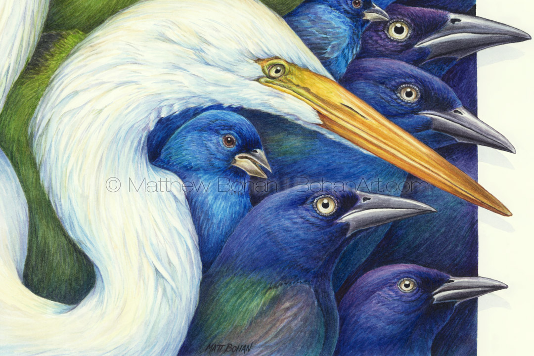
Although it may not look like it, this painting was definitely inspired by Op Artists Victor Vasarely, Julian Stanczak and Carlos Cruz-Diez. They always did interesting things with color and pattern, which essentially was what I was trying to do here. In this case highly-rendered birds serve as the subject matter rather than a flat, sharp-edged application of paint. My hope was to follow a series of different repeating patterns and gradients through the painting, some moving vertically and others horizontally. There is the obvious spectrum moving across the painting, which I broke up with the Great Egrets’ white necks.
From a design standpoint it’s normal to choose odd numbers when composing, but in this case using four egrets works since they divide the saturated spectrum into five segments. In addition, the overall motion created by the group of white birds serves as a relief amidst the spectrum of birds. I think the subtle coloring on the white feathers makes the saturated colors pop more than if they just sat next to other saturated colors. In addition, each type of bird has differing patterns of black on the saturated feather colors. I chose to have the birds nestled into one visual plane, occasionally overlapping to the right as well as breaking the plane of the frame. I find it interesting to play with the shapes of the birds and design with an eye for all the wiggling explosive movements of the animals.
In the past my “Critters” paintings have primarily featured birds but have also included mammals, insects, amphibians and reptiles. This is the first one to exclusively feature birds—fifty-five complete birds, as a matter of fact, as well as a handful of partial ones. I counted complete birds as anything with an eye and a beak. For the record that equates to these numbers: Scarlet Tanager (3), Northern Cardinal (8), Baltimore Oriole (9), American Goldfinch (1), Magnolia Warbler (4), Blue-winged Warbler (1), Wilson’s Warbler (4), White-cheeked Turaco (6), Female Crested Wood Partridge (1), Indigo Bunting (9), Common Grackle (5) and Great Egret (4).
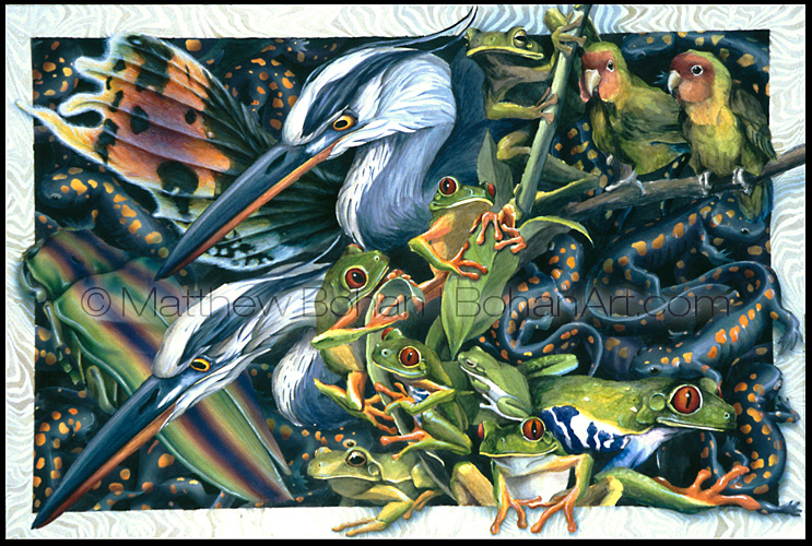
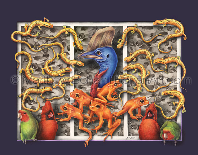
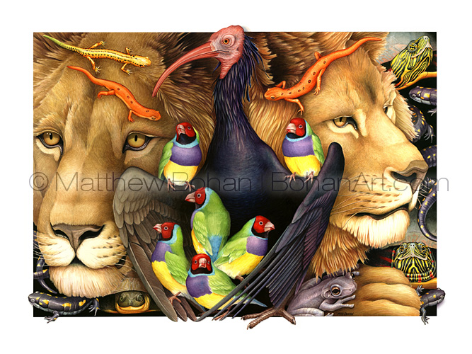
Here are the previous paintings I did in a similar style.
Critters 1 (Transparent Watercolor and Gouache on Watercolor Board 18 x 24 in, circa 1994)Critters 2 (Transparent Watercolor on Arches 140lb HP Paper 18 x 24 in, circa 1996)Critters 3 (Transparent Watercolor on Arches 140lb HP Paper 18 x 24 in, circa 2000)
Thanks, Nadine. I don’t know if I’ll ever live up to it, but wow, what a great compliment!
Leave a Reply
This website uses cookies to improve your experience. We'll assume you're ok with this, but you can opt-out if you wish. Cookie settingsACCEPT
Privacy & Cookies Policy
Privacy Overview
This website uses cookies to improve your experience while you navigate through the website. Out of these cookies, the cookies that are categorized as necessary are stored on your browser as they are essential for the working of basic functionalities of the website. We also use third-party cookies that help us analyze and understand how you use this website. These cookies will be stored in your browser only with your consent. You also have the option to opt-out of these cookies. But opting out of some of these cookies may have an effect on your browsing experience.
Necessary cookies are absolutely essential for the website to function properly. This category only includes cookies that ensures basic functionalities and security features of the website. These cookies do not store any personal information.
Any cookies that may not be particularly necessary for the website to function and is used specifically to collect user personal data via analytics, ads, other embedded contents are termed as non-necessary cookies. It is mandatory to procure user consent prior to running these cookies on your website.


Nadine Cain
Your work is beyond genius .
Matt
Thanks, Nadine. I don’t know if I’ll ever live up to it, but wow, what a great compliment!