Having spent more than 22 years as a professional illustrator, I’ve worked on a considerable number of projects using a wide variety of styles. Stylistically I gravitate towards a particular look, rendering pieces with an abundance of detail, saturated colors and plenty of contrast. I’ve been called upon to create in color as well as black and white, using paper and pencil, pen and ink, brush and palette, software and stylus, generating everything from cartoons to highly rendered 3D art. These choices depend on the project, client needs and whether or not I have to match a developed style or that of other artists working on the project.
Being an illustrator is a lot like being a session musician: at times you have to be a bit of a chameleon changing styles and blending into the surroundings. That’s one of several “truths” I’ve encountered as a professional illustrator. I’ve also found that…
- The work tends to be varied.
- Some projects are fun; some are not.
- Some clients are wonderful; some are not.
- Sometimes you are left with great memories; sometimes… well, some projects and clients are best forgotten.
In the school of trying to make something good out of something bad, I thought I’d revisit a few things I liked from projects that were sub-optimal. When I’ve spent a significant amount of time on artwork that hasn’t been fully utilized for one reason or another, I tend to look for opportunities to reuse or reinvent it.
Occasionally I’ve put in some of my own time making something for a client at a level of detail that exceeded their needs because I thought it was interesting or because I thought I could reuse it down the line. I’m always careful to “clock out” when I take a detour like this. It’s most likely to happen when creating 3D models for which I retain the copyright when providing the client with 2D-rendered art as a final product. Last year I had a project requiring various musical instruments used in jazz. Due to the particulars of that client, all the final delivered art had to be in black and white. Despite that and other limitations, I think the art had a lot of charm. Alas, the project turned out to be a dead end, but I still have the interesting 3D models I created for the instruments and for a few related projects, all of which seem worthy of reinvention.
I always thought brass instruments were fascinating with their crazy curves, valves and reflective surfaces. As a kid I remember seeing the stylized trumpet on the poster for the Sgt. Pepper’s Lonely Hearts Club Band movie. I thought it was SO COOL—the horn, NOT the rest of the poster or the movie. I was a big Beatles fan. Whose idea was it to ruin a classic album with a horrible, unwatchable flick? I think that crazy, heart-shaped trumpet was the only positive thing about the the movie. I was a bit deflated to hear that it wasn’t even playable, that it was merely a sculpture. Someone has since made a playable version of it. I have no idea if it sounds decent.
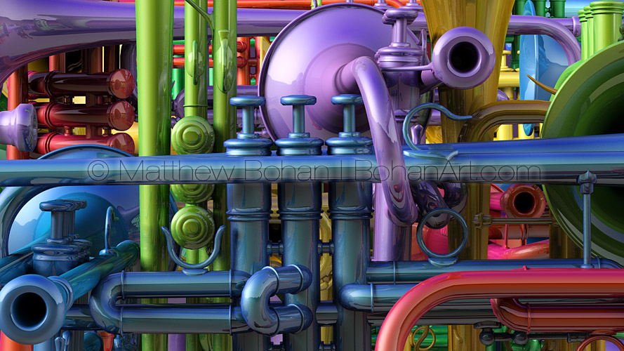
Anyhow, I always thought it would be fun to do some art with a trumpet or French horn. The closest I got to it before was making pen-and-ink drawings of my mother’s flute and my brother’s clarinet. All those valves are levers are über-cool. Well, the poor trumpet I modeled to create the art for the client mentioned above was gray. Why not breathe some new life into it with all sorts of crazy color variations, reflections and shadows? The combinations of straight lines, curves and circles of the overlapping instruments was a lot of fun to play with. Next I have to see what I can do with a piano, banjo and upright bass!

