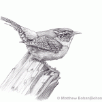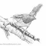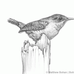
Carolina Wrens are fun little birds. They seem to be clever. My office and studio are in the basement of our house. It’s a nice space with one drawback: I have a only a small window well for natural light. I suppose the benefit is that I’m not staring out the window all day instead of working. I can easily lose an hour looking through a window. Well, the Carolina Wrens occasionally pop into the window well to hunt for insects and spiders. Their visits increase dramatically in the winter, when food is scarce and they get the added benefit of some heat from the house and shelter from the wind. As a matter of fact, one just appeared while I was writing this. At only 7° F, today is a cold one. If I put a suet cake in the window well, they’d probably never leave! In the past I’ve been tempted to put some freeze-dried mealworms out there to keep them going on the coldest winter days. Carolina Wrens are especially hard hit when temperatures drop.
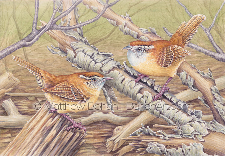
I got the reference photos for this painting using a 400mm lens from the kitchen window. The wrens stop in to visit the suet feeders and for occasional forays to the seed feeders. They investigate everything.
My photos had plain blurry green backgrounds. While pretty for a photo, this can result in a “Bird-on-a-Stick” painting that can be dull. I wanted to paint a pair of wrens, but compositionally, items are best painted in odd numbers. Bird duos occur naturally in nature but make for a design no-no. Their pairing in a painting can lead to the dreaded “dumbbell” composition, which keeps your eyes ping-ponging between two items. To counter this I usually try to bring in other elements that will help move a viewer’s eye around the page. In this case that meant imagining an entirely new background and setting for the wrens.
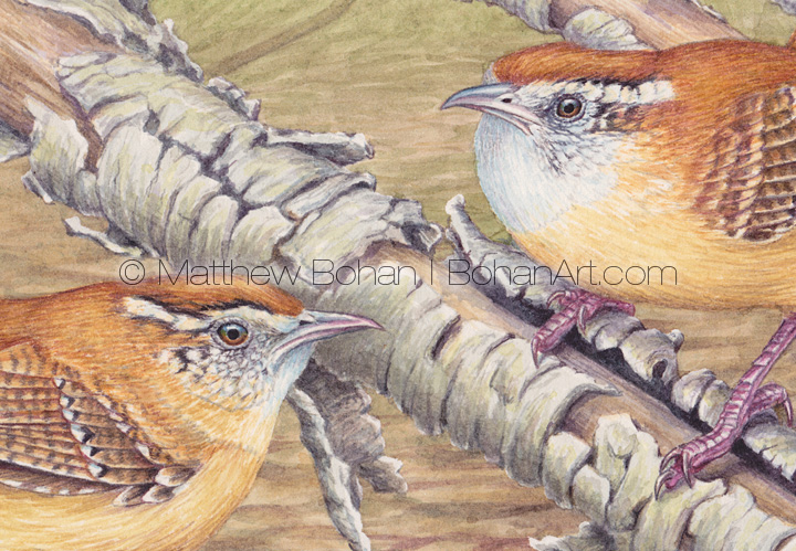
I tried to arrange branches with lots of diagonals running parallel to the birds’ poses. In theory this adds more movement and energy to the painting. I also wanted to strictly control what the background was doing relative to the birds and branches. This meant having the background decrease in contrast and detail with distance. At the same time my hope was to have the warm brown tones of the birds against cooler colors so they’d really pop off the page. It’s challenging to strike the right balance between getting a good clear image while still having the bird work well in its natural environment.
Struggling with this painting’s composition got me thinking. When I was in art school various popular artists were routinely trashed by students and teachers alike. It was a little too early for Tomas Kinkaid to (deservedly) receive the full wrath of the art school glitterati, so Normal Rockwell was raked over the coals regularly. Although I can’t think of anything positive to say about Kincaid, I was familiar with some of Rockwell’s work and never understood the rage it engendered. Years later I got a few books out of the library on Rockwell to see if the vicious remarks were deserved. While some of his compositions were much more complex than others, the art was always well rendered. I suppose the first strike against Rockwell in the art school setting was that he was an excellent draftsman and was realistic. “Back in my day” art schools seemed to focus on abstract expressionism. Any applied and representation art was considered lowly, unimaginative and derivative. There are a lot of illustrators who get thrown under the bus because of this.
The art school folks dismissed Rockwell’s work, complaining that he painted many popular scenes of average life. So what? Plenty of great artists like Bruegel the Elder, Hopper, Vermeer and others have been genre painters but were celebrated for it rather than being condemned. Rockwell used photos for reference, but so did Vermeer… essentially. Critics also complained that his work evoked the emotional response of the viewer. There is some hypocrisy there, since so many of the avant-garde like Serrano seem to want to have us have a visceral response to their work. Perhaps Rockwell was too patriotic and optimistic for them? I can’t claim to know what they are thinking.
The thing that totally won me over for Rockwell was how well he composed, prompting your eye to move around the page in many of his paintings. Everything in the images works together to this end. That doesn’t happen by accident. It takes a lot of skill, effort and experimentation. In my option many of his works were fantastically designed. If his work is bad… then I hope mine is as bad as his someday!

