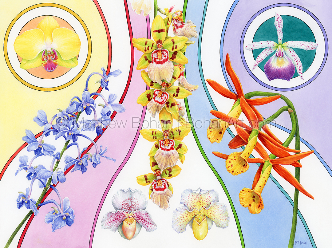
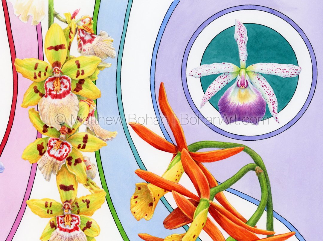
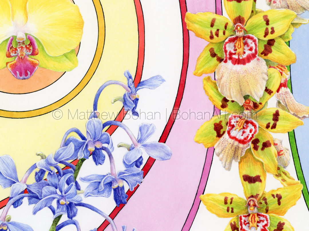
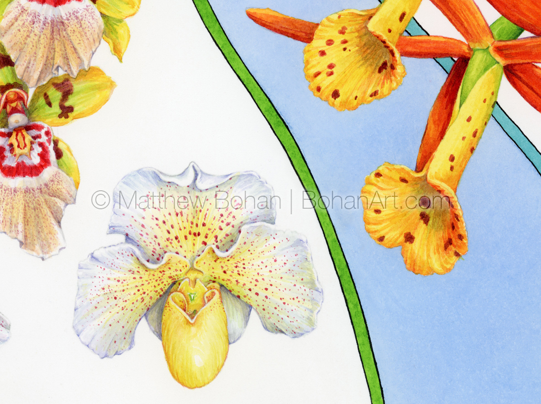
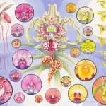
It was time to get another orchid painting done! The past few years I’ve completed a watercolor of orchids for the Greater Lansing Orchid Show, which always includes a small exhibition of art. For ages I’d go to take photos of the plants and see the submitted paintings and think, “I should do that one of these years.” Eventually I was motivated early enough to create something for the show. Typical for me, I wanted to do something a bit different. I like botanical art, but doing a traditional treatment would feel too much like work (medical illustration). I’m not as interested in painting a complete specimen with leaves and aerial roots; I’ll stick to the “fireworks” and just do the flowers.
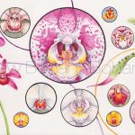
For this painting I used photos I took at last year’s show for reference. When I started drawing orchids, I did a bunch of round images combined onto one page. It was a bit of a throwback to doing botanical illustrations in grad school, where I’d include magnified views of smaller structures like individual florets or seeds that were shown in circles with the magnification listed next to the spot illustration. I really liked working with those little circular images and thought it would be fun to bring that look into the more “artsy” paintings.
I’m not very fond of plain white backgrounds. I tend to find them boring. Everything ends up looking like a spot illustration or clip art. At the same time, I didn’t want to render a background that implied a specific setting for the flowers. In the end I used stripes of color to tie the various flowers together and provide some motion in the painting.
Having been a child in the 70s, there was a ton of art and graphic design of highly varying quality in advertisements, TV and movies. We were bombarded by it and continually absorbed the images. Honestly, a lot is best forgotten, but some really appealing visual ideas popped up now and again. Through the sieve of time, we tend to remember the real extremes. The horrific or the terrific. One thing I tended to like were some of the linear, stripy designs with flat colors. While working on this painting, I recalled some of those images to play with in the background. I spent over a day just testing options of flowers, designs and colors before settling on this. In the end, I’d call this one a bit of a 70’s throwback.
Please contact me if you’re interested in buying the original watercolor or a print of this painting. Some of my work is also available for licensing.



Leave a Reply