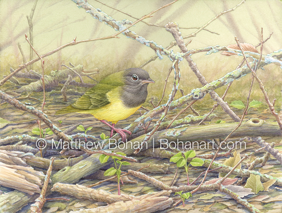
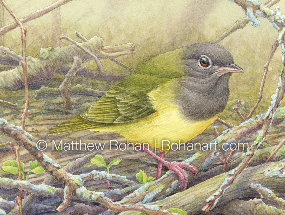
Connecticut Warblers are exciting birds. I think of them as “15-20 year birds” because I see them so infrequently. I’ve only gotten to see them twice. My first was after about 15 years of birding! The second was almost 15 years after that. In both cases the sighting followed a lot of work and patience. Connecticut Warblers are uncommon, and in addition to their small numbers, they are skulkers that like to forage on the ground, often in tangled branches and bushes. That combination makes them incredibly difficult to find.
The best look I had was at Magee Marsh during spring migration, when my whole family got to see and photograph one. What a thrill to share with each other! I based this painting on photos from that day. My shots weren’t great, but at least they were diagnostic.
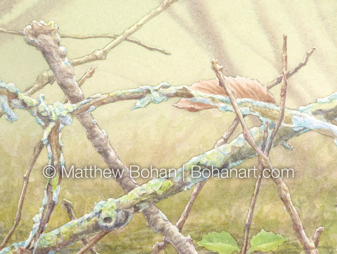
One challenge with this watercolor was trying to capture the feel of the dense habitat they prefer without having it be a terrible, jumbled mess. My plan was to lose a bit of the complexity in the top of the frame by showing a few larger, less contrasty branches breaking up that space. I’d allow the middle ground to be busy and have some flat, lower elements to lead the eye in.
The colors on this one were a little different. I tried to keep much of it desaturated. I used a lot of French Ultramarine in rendering shadows, which was a fun change. This watercolor required a ton of frisketing before I could paint the bird in the foreground.
This was my first complex painting on the Kilimanjaro cold press paper. In general, I was still really happy with the paper. It allowed the background with the blurred branches to go in easily yet was smooth enough to get a lot of detail where I needed it.
For my next painting I decided to do a larger, super detailed 18×24-inch piece, so I switched back to my usual Arches 140 LB hot press paper, which is in a block of that size. It’s fun to be working on hot press again. Both papers are great, and each has its advantages.
***
If you’d like to subscribe to my monthly newsletter for watercolor tips, techniques, resources and recommendations, sign up here.
If you’re interested in buying the original watercolor of this or another painting on this site, let me know. Prints, licensing and commissioned work are also available.
You can see more of my work on social media here.
")


