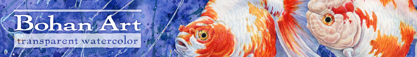
Winter Black-bellied Plover Pencil Sketch, Watercolor and Time Lapse
This watercolor painting and pencil sketch of a Black-bellied Plover are from the stockpile of photos taken on last year’s trip to Florida with my brother Ted. The drawing is p84 from the sketchbook. I’m getting dangerously close to finishing … Continued
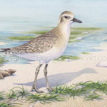
Dunlin Pencil Sketch p85
I’m pretty bad when it comes to shorebirds. I can hold my own with birds of the forest and field as well as ducks, but if you take me to the shore, I start scratching my heard and looking through … Continued
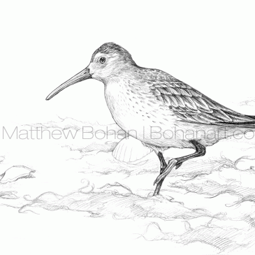
Winter Willet Pencil Sketch p83
I saw my first Willet thanks to my friend Don Brown. While living in New Jersey years ago, I drove out to Jones Beach, Long Island, to go birding with him. Jones Beach is known for great winter birds, and … Continued
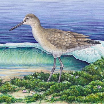
Winter Willet Transparent Watercolor
I love birds but have a definite weak spot in my life list when it comes to shorebirds. Having lived mostly inland, far away from the coast, I’ve missed out on seeing many of these birds. I enjoy watching them and learning … Continued
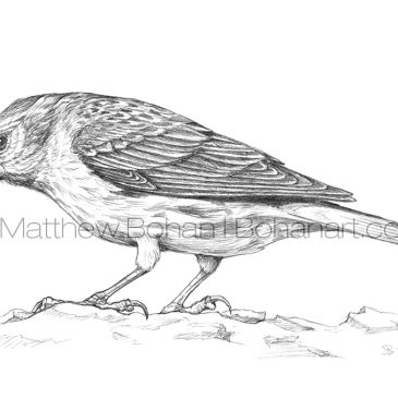
Pine Siskin Pencil Sketch p82
Winter finches are always a welcome sight. After all the migrants trail off, it’s nice to see old friends at the feeders. Pine Siskins are fairly reliable. We get them at the feeders every year, though the quantity tends to vary dramatically. A finch … Continued
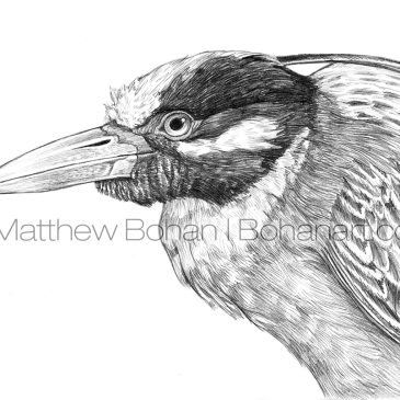
Yellow-crowned Night Heron Pencil Sketch p81
Night-herons are undeniably neat creatures. I first came across them during trips to Florida when I was a grad student and assisting with a course called Ecology of the Everglades. I had a tough time picking which I liked better, the Yellow-crowned or Black-crowned. Typically, the … Continued
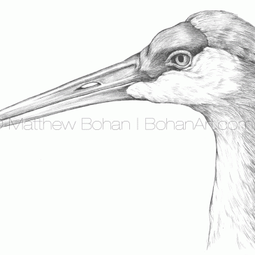
Sandhill Crane Pencil Sketch p80
Growing up in western New York state, I never saw Sandhill Cranes. My first encounter with one was during a bike ride shortly after moving to Ann Arbor to go to grad school at the University of Michigan. Rolling along … Continued
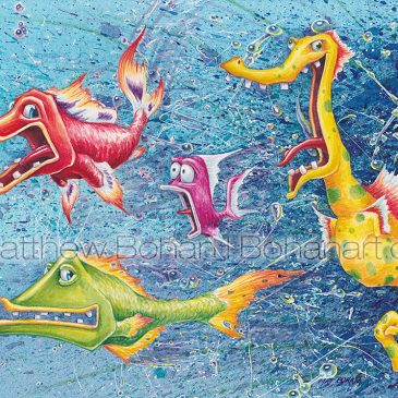
Crazy Horse Transparent Watercolor
While doodling around one day I started a sea horse drawing. With these caricatures I’m always anthropomorphizing. It seems to me that seahorses are always portrayed as beautiful and classy creatures. Why should they get all the glory? Come on… I’m sure there are … Continued
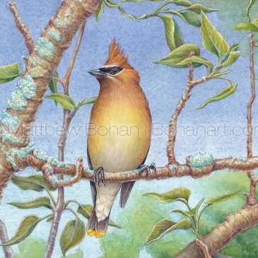
Cedar Waxwing on Blue, Transparent Watercolor
The sleek, fine feathering of Cedar Waxwings makes for a good challenge in watercolor. When picking out what to paint next, I usually try to choose things I’ve not done before. Breaking new ground keeps things fresh and offers new challenges. … Continued
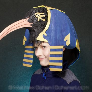
Early Halloween…Egyptian Hats! Thoth Ibis and Unified Egyptian Crown
Unlike many of the last few years, this year’s Halloween hats were created months ago. While I was in Florida with my brother last winter, I got a call from home informing me about an upcoming Egyptian-themed costume party. It had been suggested … Continued