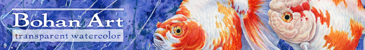
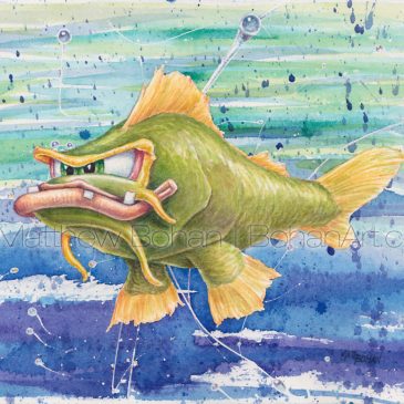
More Crazy Fish Caricatures in Transparent Watercolor
Well, I had enough fun painting the previous fish that I thought I’d do a few more. These are a 180º from the day job, medical illustration work. With that, every artery, muscle, tendon and bone has to be in just the perfect place, … Continued
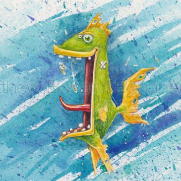
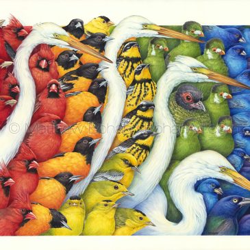
Crazy Fish Caricatures: Eight Transparent Watercolor Paintings
Now for something COMPLETELY DIFFERENT! I suppose these are going to need some serious explanation. After spending close to a hundred hours on my previous painting, I thought it made sense to do a few quick pieces. Now I’ve never … Continued
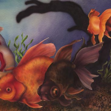
Early Goldfish Watercolor Painting
While cleaning up my archives, I came across this old painting that I did in 1989. I’d honestly forgotten that I’d done it. This was my first airbrushed painting, created in preparation for a grad school class that was coming up. At … Continued
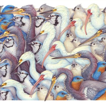
Whites and Blues C5 Transparent Watercolor & Time-Lapse Video
After taking a break from doing these incredibly complex paintings for about 20 years, I did two back-to-back. Maybe that wasn’t the best idea, as this one took just shy of 100 hours! I could’ve completed about seven of my typical paintings … Continued

Fall Sale!
Fall Sale! 10% Off Select Originals This is the first time I’ve offered a discount on my originals, and when they’re gone, they’re gone! Visit our Etsy shop before your favorite is shipped to someone else.

Nature Chemistry Cover Art
Over the last couple of years I’ve collaborated with Michigan State University faculty members to create cover art for a variety of different scientific journals. Most recently, I worked with Aaron L. Odom, Ph.D., to design the cover art for the September 2017 issue of Nature Chemistry. I … Continued
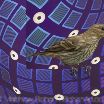
More Op Art Birds!
It’s time for even more op-art* bird photos. These are Victor Vasarely-inspired designs. Like the previous images, these are straight-on photos of birds perched on an op-art bird feeder… without any Photoshop trickery. I designed this image to go with … Continued
Flying Colors Transparent Watercolor & Time-Lapse Video
Well, I’ll cut to the chase. This 18 x 24-inch watercolor took an incredibly long time, somewhere in the 70- to 80-hour range, and it was one of the more complex paintings I’ve ever attempted. There isn’t a lot of … Continued
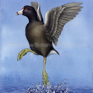
Throwback Thursday: American Coot Watercolor
This is an older painting, probably from 2002. I still remember sketching this stuffed specimen in the Royal Ontario Museum. My wife had a conference in Toronto, so I tagged along and spent three full days drawing at the ROM. … Continued
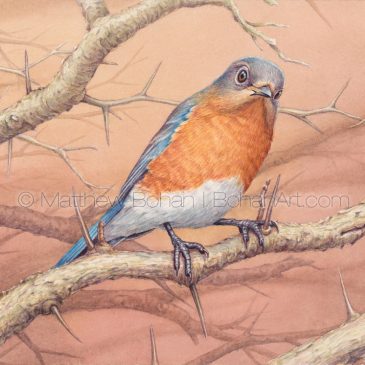
Female Eastern Bluebird Transparent Watercolor & Time-Lapse Video
I finished this painting in May but am just now (finally) getting it posted. I’ve not been idle though. I’ve been busy on a complicated painting that I’ll share soon. Like most people, I love bluebirds. I’ve painted the brilliantly colored males … Continued