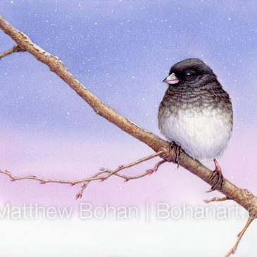
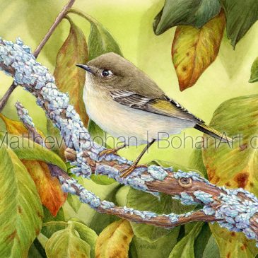
Female Yellow-rumped Warbler (Myrtle Warbler) Transparent Watercolor and Time-lapse Video
I tried not to overwork this painting and wanted to leave things a bit looser on the bird than I might normally do. My photo reference from a trip to Ohio was contrasty. I ended up softening the lighting a … Continued
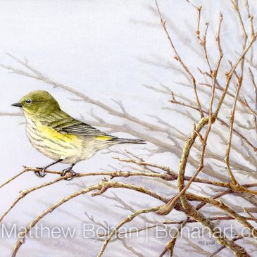
Dark-eyed Junco Transparent Watercolor and Time-lapse Video
The colors of Dark-eyed Junco are not exactly thrilling when compared to something like a Painted Bunting, but they are spectacularly beautiful in their simplicity.
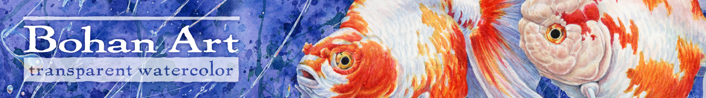
Yellow-rumped Warbler (Myrtle Warbler) Transparent Watercolor and Time-lapse Video
Yellow-rumped Warblers are easy to find here in Michigan during migration, but this is my first time painting one.
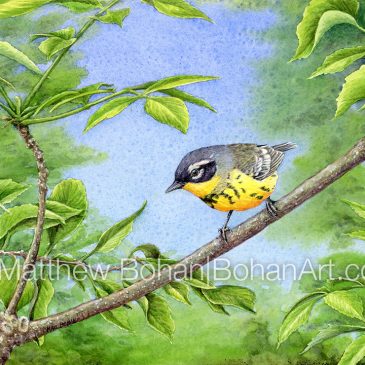
Magnolia Warbler: Transparent Watercolor and Time-lapse Video
Who doesn’t like Magnolia Warblers?!
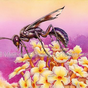
Great Black Digger Wasp: Transparent Watercolor and Time-lapse Video
Over the years I’ve learned that most wasps, bees and hornets are pretty tolerant of humans, and if you approach them carefully, they leave you alone.
Ruby-crowned Kinglet: Transparent Watercolor
Last fall we went on a family birding trip to northern Ohio for migration, and these little birds were everywhere that weekend.
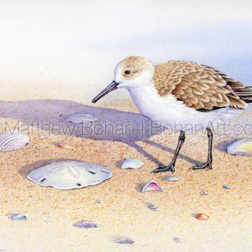
Sanderling and Sand Dollar: Transparent Watercolor and Time-lapse Video
In my photos from Sanibel, the beach was covered with tons of Sanderlings, with shell debris around many of them.
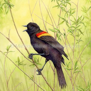
Red-winged Blackbird: Transparent Watercolor and Time-lapse Video
In Michigan Red-winged Blackbirds are plentiful and conspicuous in every season but winter.
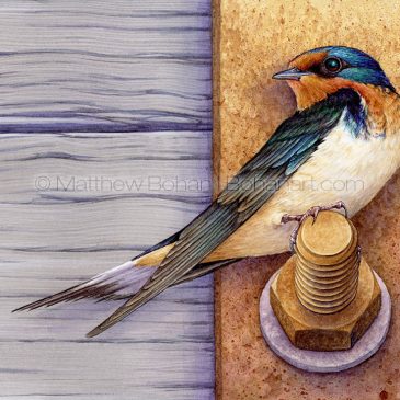
Barn Swallow on Bolt: Transparent Watercolor and Time-lapse Video
I based this painting on photos taken at the Marsh Boardwalk at Point Pelee National Park in Ontario.
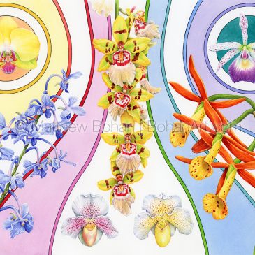
Orchids and Stripes: A 70’s Throwback in Transparent Watercolor
Through the sieve of time, we tend to remember the real extremes. The horrific or the terrific.