Red-winged Blackbird: Transparent Watercolor and Time-lapse Video
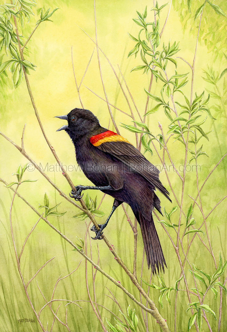
In Michigan Red-winged Blackbirds are plentiful and conspicuous in every season but winter. Their “Frito Lay” call is continually heard near ponds and wetlands on warm days.
Although almost “dirt common,” they are interesting birds to watch for many reasons. First, they are super territorial and make frequent displays to assert their dominance over a given area. Second, they have a lot of interesting behaviors. Third, these birds seem completely fearless. I’ve watched them chase after Red-tailed Hawks many times, relentlessly dive bombing them in mid-flight. You have to admire their bravery. I suppose they are more maneuverable, like little fighter jets compared to a bomber.
I’m guessing that the boldly colored male Red-winged Blackbird is one of the first birds identified by beginning birders, while the drab and inconspicuous female goes “incognito” for quite a while.
Please contact me if you’re interested in buying the original watercolor or a print of this painting. Some of my work is also available for licensing.
Barn Swallow on Bolt: Transparent Watercolor and Time-lapse Video
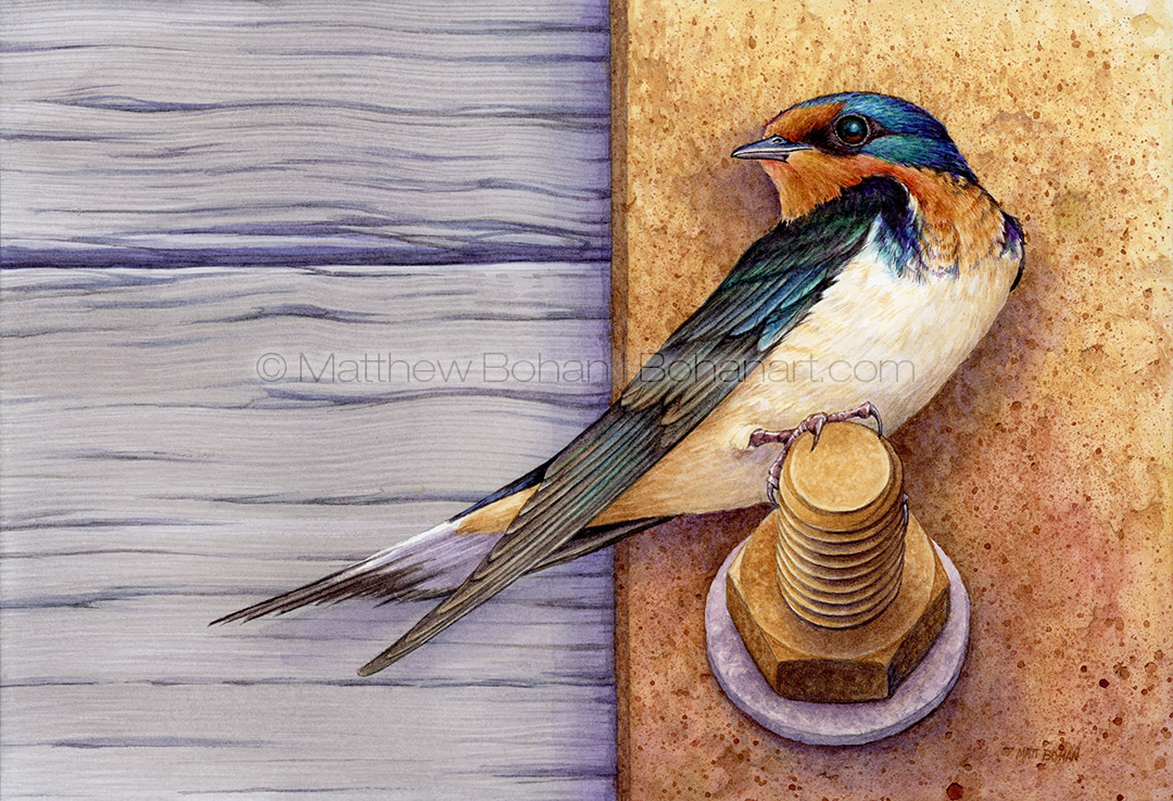
This may be the year of the swallows. I went from never having painted a Barn Swallow to doing a several swallow paintings in the past year. They definitely are a worthy subject.
I based this painting on photos taken at the Marsh Boardwalk at Point Pelee National Park in Ontario. It was only about five yards from where I took the photo for the painting of the grumpy pair. This may even be one of the same individuals.
Barn Swallows are beautiful birds. I love their warm brown and cream colors and how those contrast with the glossy metallics of the head, wings and tail.
I was happy with my photo reference shots but wanted to paint a version where I could play with the composition a bit and flatten the perspective. What drew me to the photo was the blocks of color and how they broke up the page. I thought it would be fun to amp up the colors, breaking them into discrete horizontal and vertical segments almost like a flag. It was fun to play with the slight changes in proportions of the rusty plate and beams of wood to see how they divided up the frame.
Please contact me if you’re interested in buying the original watercolor or a print of this painting. Some of my work is also available for licensing.
Orchids and Stripes: A 70’s Throwback in Transparent Watercolor
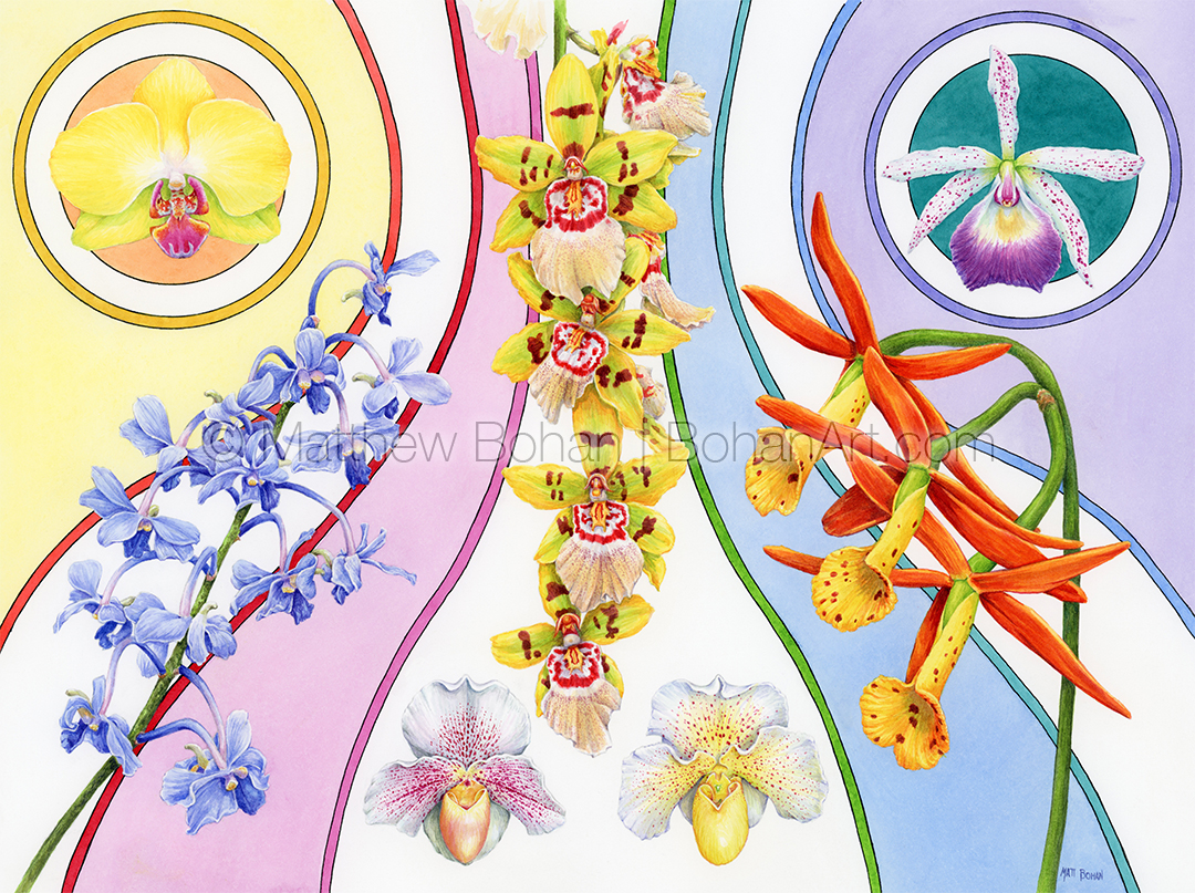
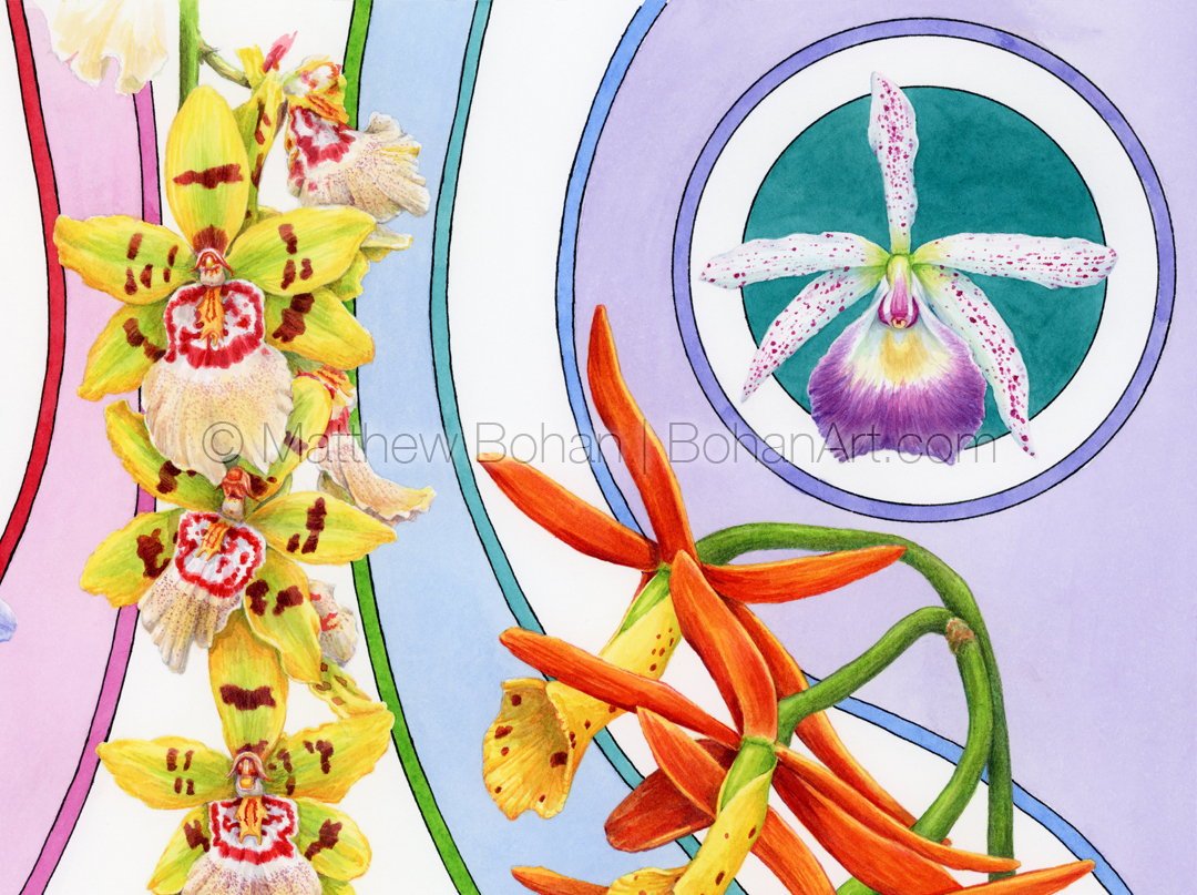
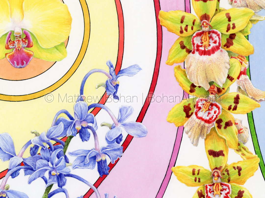
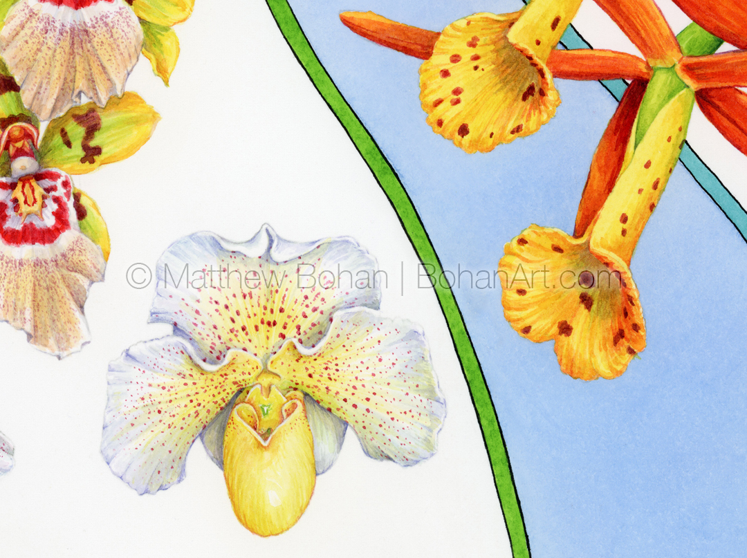
It was time to get another orchid painting done! The past few years I’ve completed a watercolor of orchids for the Greater Lansing Orchid Show, which always includes a small exhibition of art. For ages I’d go to take photos of the plants and see the submitted paintings and think, “I should do that one of these years.” Eventually I was motivated early enough to create something for the show. Typical for me, I wanted to do something a bit different. I like botanical art, but doing a traditional treatment would feel too much like work (medical illustration). I’m not as interested in painting a complete specimen with leaves and aerial roots; I’ll stick to the “fireworks” and just do the flowers.
For this painting I used photos I took at last year’s show for reference. When I started drawing orchids, I did a bunch of round images combined onto one page. It was a bit of a throwback to doing botanical illustrations in grad school, where I’d include magnified views of smaller structures like individual florets or seeds that were shown in circles with the magnification listed next to the spot illustration. I really liked working with those little circular images and thought it would be fun to bring that look into the more “artsy” paintings.
I’m not very fond of plain white backgrounds. I tend to find them boring. Everything ends up looking like a spot illustration or clip art. At the same time, I didn’t want to render a background that implied a specific setting for the flowers. In the end I used stripes of color to tie the various flowers together and provide some motion in the painting.
Having been a child in the 70s, there was a ton of art and graphic design of highly varying quality in advertisements, TV and movies. We were bombarded by it and continually absorbed the images. Honestly, a lot is best forgotten, but some really appealing visual ideas popped up now and again. Through the sieve of time, we tend to remember the real extremes. The horrific or the terrific. One thing I tended to like were some of the linear, stripy designs with flat colors. While working on this painting, I recalled some of those images to play with in the background. I spent over a day just testing options of flowers, designs and colors before settling on this. In the end, I’d call this one a bit of a 70’s throwback.
Please contact me if you’re interested in buying the original watercolor or a print of this painting. Some of my work is also available for licensing.
Hardbound Sketchbook Video Tour
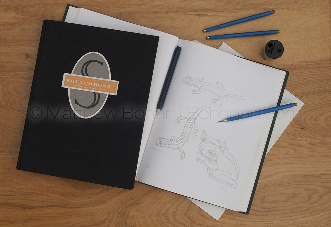
Years ago I switched to using hardbound sketchbooks. The paper is high quality, and it’s fun to have a bound collection of finished drawings. If you are a “details” nerd like me, you may have noticed that traditionally bound books are composed of many little sub-stacks of pages that are stitched together. These are called signatures and are further assembled into a larger stack that gets trimmed and attached to the endpapers and cover. (Patience. This will be relevant in a minute.)
For me, using a hardbound sketchbook poses a challenge that was initially unexpected. If you tear a page out, the opposite side of the bound signature will fall out, since it is no longer held by the stitches and the opposing page. Because of this, I never remove pages from my hardbound sketchbooks, so I feel pressured to produce a high-quality sketch on every page. The sketchbook in the video is complete. One page is blank, since it had been ruined by a blot of ink, but no pages were edited or removed. The majority of the drawings were completed while waiting for my kids to finish their karate classes. That explains why there are pages toward the back that include a few doodles, cartoons or quick sketches I created to entertain children who were also in the dojo waiting room.
All the sketches were done on my lap using a lead holder with mostly 4-6h pencils, a lead pointer and loads of erasing. Everything other than the doodles was sketched from my own photos.
In full disclosure, this wasn’t the only sketchbook I used during this time. I did a ton of working sketches and thumbnails for other projects on printer paper. The sketchbook was reserved for more finished drawings and studies for potential paintings. In the cases where the sketch was eventually turned into a painting, I included a small version of the painting in the corner of the video.
If you see something in the video that you’d like to purchase as an original or print, please contact me. Also, some of my work is available for licensing.
Blue-capped Motmot Transparent Watercolor and Time-lapse Video
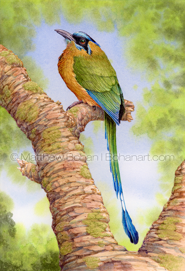
I’ve never gotten to see a motmot in the wild. Maybe someday! I’ve had to be satisfied with seeing them in zoos. In fact, the photos I took as reference for this were from the Syracuse and Toledo zoos. My daughter, on the other hand, was lucky enough to see them in the wild when she went to Costa Rica for a study abroad program last year. I’ve had this sketch ready to paint for ages and just got around to painting it. I kept picking other things because the composition was a bit straightforward compared to what I’ve been drawn to lately.
Motmots are interesting birds in the order Coraciiformes, which also includes kingfishers, todies, bee-eaters and rollers. They definitely look a lot like bee-eaters. A distinctive feature of many of the motmots is their distinctively shaped lollipop-like tail. The individual bracts of the feathers are weaker in the near-distal section of the tail and break off when abraded against branches, leaves, rocks or other obstructions, leaving the racket shape at the end. While the birds are pretty well camouflaged for jungle living, they can often be found because of the way they wag their tails like a pendulum. This is often in response to the individual motmot seeing a predator; it lets the threat know that the motmot is aware of its presence and is ready to take flight. This saves both animals the energy of a chase through the woods. The beautiful tails are also thought to play a role in display when wooing potential mates.
Please contact me if you’re interested in buying the original watercolor or a print of this painting. Some of my work is also available for licensing.
Please contact me if you’re interested in buying the original watercolor or a print of this painting. Some of my work is also available for licensing.
Eastern Phoebe Transparent Watercolor and Time-lapse Video
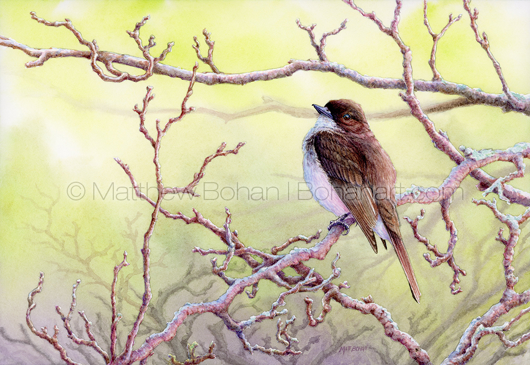
I always love seeing my first Eastern Phoebe of the spring. Often it is before many of the other insect-eating birds return. Noticing a pumping tail is one of the things that tips me off to its identity, even if it is a distant glimpse.
This painting was done based on photos I took at Maumee Bay State Park in Ohio this past May. We usually make a family trip there each spring and fall to see migrants navigating their way above or around Lake Erie. We have been blessed there with many great days and loads of cooperative birds. I especially love fall birding in northern Ohio because it has fewer crowds. In recent years “The Biggest Week in Birding” has made it challenging to navigate the area in the spring. We usually try to avoid that week (~10 days) and hit it just before or after. The birds are still good, and we have a great time!
This painting had some unusual challenges. I was really drawn to the branches dividing up the frame in interesting patterns. I wanted to make the background somewhat atmospheric, with loss of focus and contrast as things receded back. Additionally, the photos I used for reference had subtle pinkish side lighting from the early morning light coming from the far right plus a fill light of blue. That’s a bit unusual, especially on a bird that is white and gray brown, but I think that in the end the bird reads as the right colors, even if it is washed in those hues. Having the other branches bathed in that light makes everything seem to read correctly. If I were illustrating for a field guide, I’d approach the problem differently and use very neutral light, but for a painting for my own amusement, bringing in those extra colors just makes everything more interesting and visually appealing… at least to me!
Please contact me if you’re interested in buying the original watercolor or a print of this painting. Some of my work is also available for licensing.
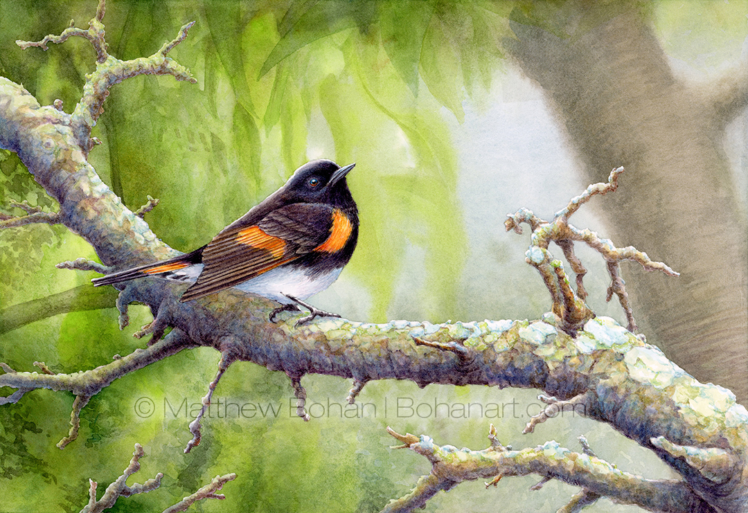
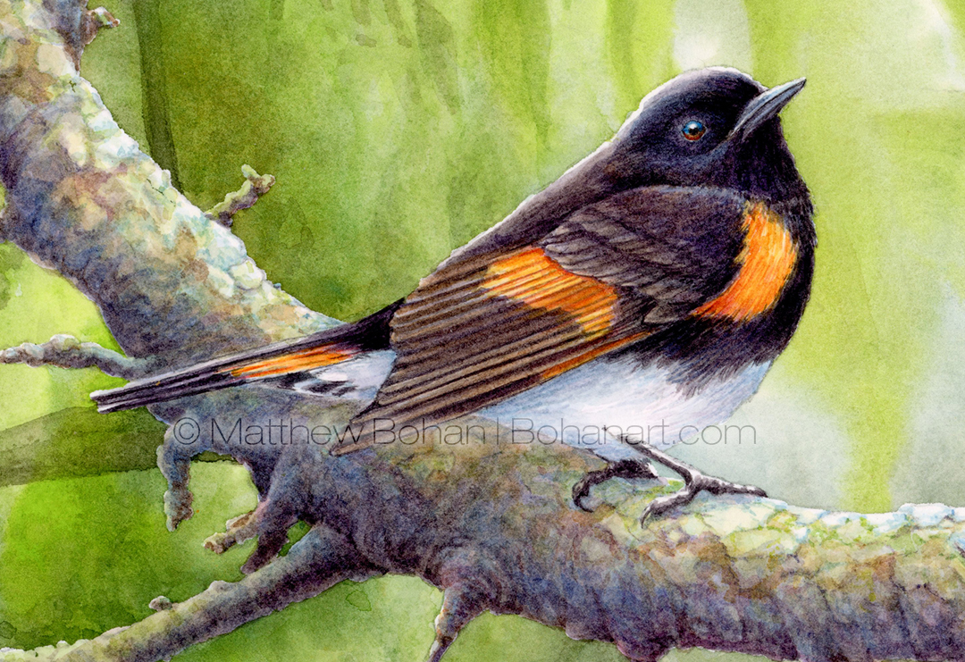
American Redstart Warbler Watercolor and Time-lapse Video
 Detail from American Redstart (7×10-inch Transparent Watercolor on Arches 140lb HP Paper)[/caption]
I always love seeing American Redstarts. We live in their breeding range, and over the past few years, several have nested in the park where I regularly go mountain biking. I now get to hear them all summer and not just when they migrate through our area, unlike most of the other warblers. I’ve painted them only once before, and that was about fifteen to twenty years ago. They were definitely worthy of a revisit. I got the photo references for this painting in northwest Ohio, on our annual spring migration birding trip. The main image had some interesting and subtle backlighting that was fun to work from.
To stretch my skills with watercolor, I usually try to do something new or challenging for each of my paintings. After decades of using watercolor, I still find things I’d really like to improve. It is a medium that you can tame, but there are always things to be mastered. For this painting I wanted to have areas with different levels of focus, backlighting and to try to keep some areas loose. In the end I was happy with it and had a lot of fun working on it!
Please contact me if you’re interested in buying the original watercolor or a print of this painting. Some of my work is also available for licensing.
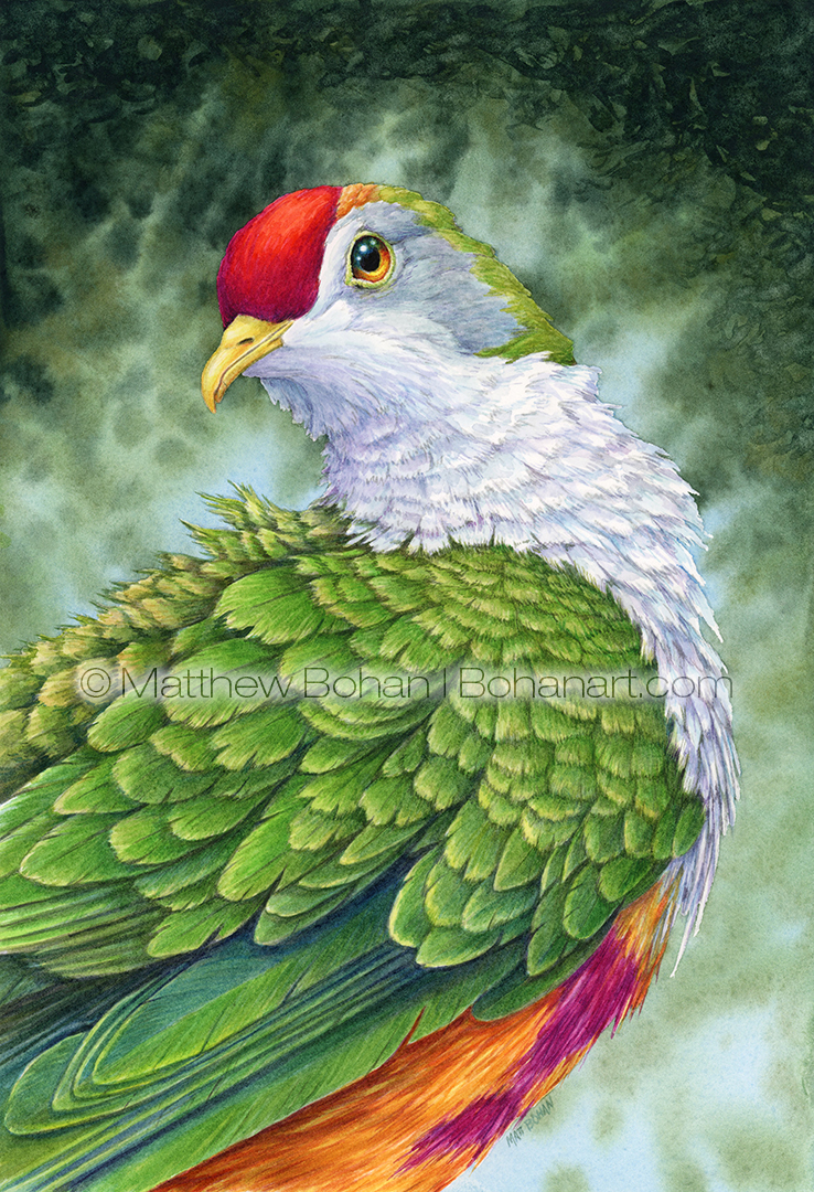
Beautiful Fruit Dove Transparent Watercolor and Time-lapse Video
Hello and Happy New Year!
I’ll be sharing five posts over the next ten days, and because of this one’s festive colors, my wife deemed it the most appropriate for kicking off 2023.
The Beautiful Fruit Dove (Ptilinopus pulchellus) goes by several common names, including the Rose-fronted Pigeon and Crimson-capped Fruit Dove. Those names perhaps better describe the diagnostic features of this particular species, because all of the fruit doves are incredibly beautiful. Okay, maybe the word “Pigeon” doesn’t conjure up the best images for city dwellers, but the ones they’re thinking of are also known as (feral) Rock Doves. Honestly, Rock Doves are also quite attractive in my opinion, but probably too familiar to be appreciated. The names Pigeon and Dove seem to be used somewhat interchangeably. In fact, pigeons and doves are all in the Order Columbidae. In general, the name dove tends to be used for smaller birds in the order and pigeons for the larger ones, but it isn’t a scientific distinction based on taxonomic significance. It is a similar to naming an amphibian either frog or toad in the Anurans. Drier skinned Anurans tend to be called toads and wetter skinned ones called frogs, but it isn’t a scientific delineation.
These gorgeous fruit doves are found from Indonesia to New Guinea. I got my reference photos on a trip to the Syracuse Zoo years ago. Although that zoo isn’t the biggest, they always had great displays and a wide variety of animals that seemed happy. As a group the fruit doves are quite spectacular, and the genus includes 57 species. Do yourself a favor: run a quick google image search on “Fruit Dove” and prepare to have your socks knocked off. We tend to think of doves as being drab, but these give parrots a run for the money!
Please contact me if you’re interested in buying the original watercolor or a print of this painting. Some of my work is also available for licensing.
Cedar Waxwing on Broken Perch Transparent Watercolor and Time-lapse Video
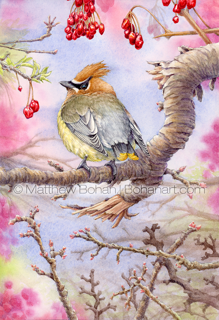
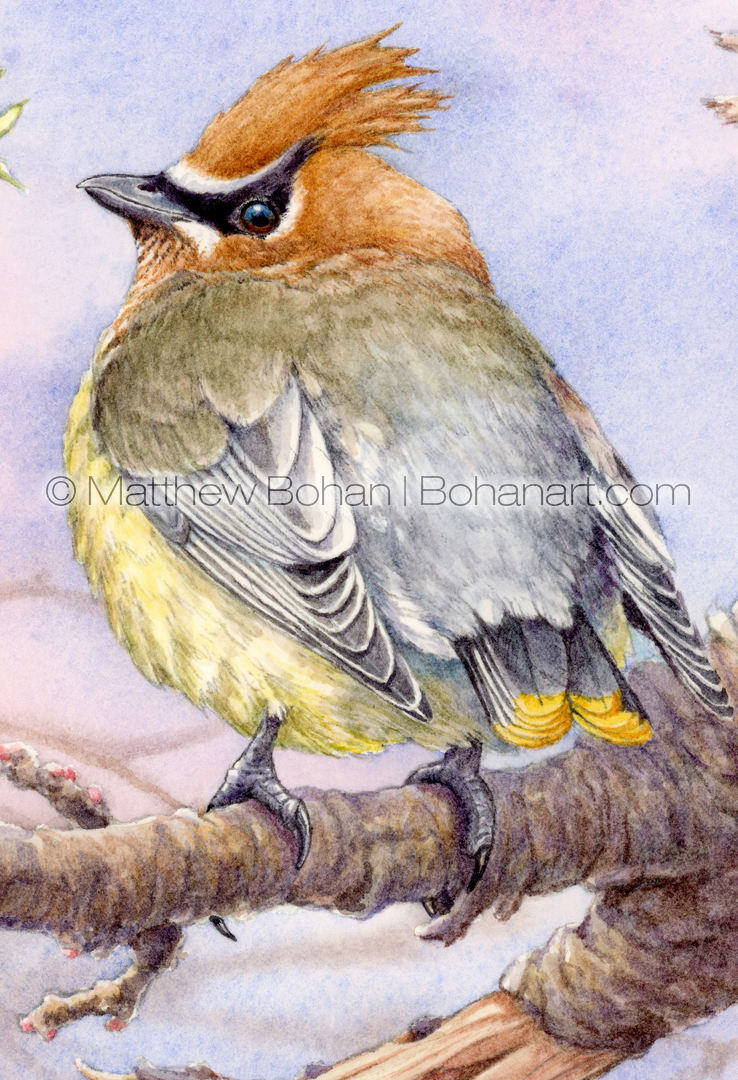
Cedar Waxwings are undeniably gorgeous birds. I’ve sketched them many times, but this is only my third time painting one. I think this is my favorite so far.
For a long time I tried to invest in painting subjects that I hadn’t rendered before, and I avoided multiple paintings of the same type of bird. Lately I’ve decided to just do whatever is currently capturing my interest. If it happens to be a repeat, who cares? Cedar Waxwings certainly are worthy of repeated investigation! The most I’ve painted a given species depends on how you define your numbers. If you count each individual bird in a painting, the record would definitely go to Common Goldeneye ducks. I once did a painting with 89 Common Goldeneyes in the background. I’ve also painted flocks of White Ibis, so counting that way would probably make them come in a distant second.
If you count not by individuals but by the main subject of my paintings, then the top number probably goes to Great Blue Herons, Great Egrets or Belted Kingfishers. I’ve revisited each many times. The long necks of those wading birds really are fun to work with compositionally, and Belted Kingfishers are just awesome birds to look at; they also seem to have extroverted personalities.
Every March or April Cedar Waxwings come to the American Highbush Cranberry (Viburnum trilobum) shrubs next to our garage. I like to pull out the garage window and shoot tons of photos unnoticed and at close range with a 400mm lens. What a thrill! I have a large backlog of Cedar Waxwings images that I’d like to paint.
Please contact me if you’re interested in buying the original watercolor or a print of this painting. Some of my work is also available for licensing.
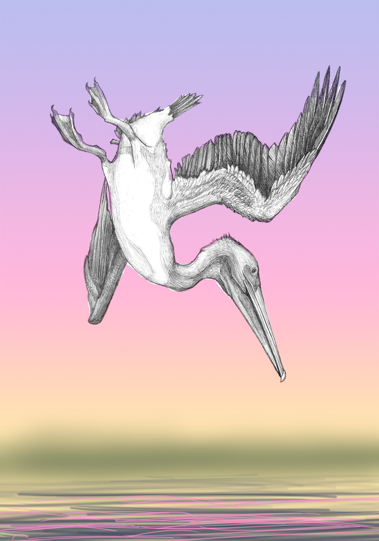
Diving Brown Pelican Transparent Watercolor and Time-lapse Video
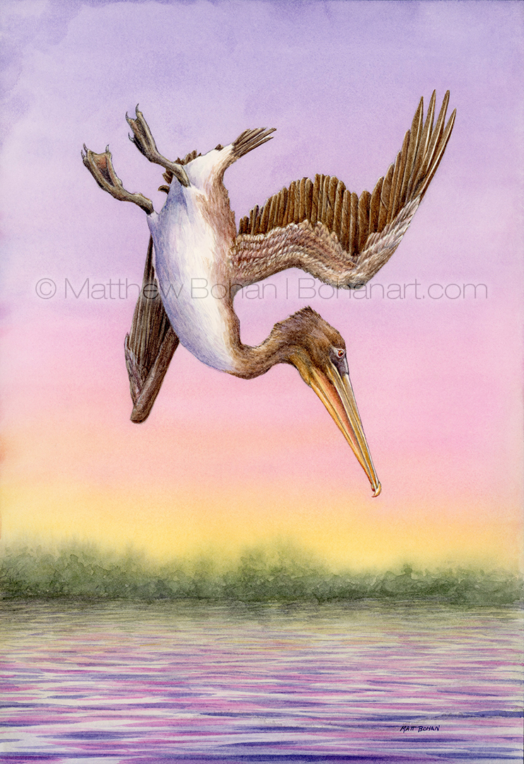
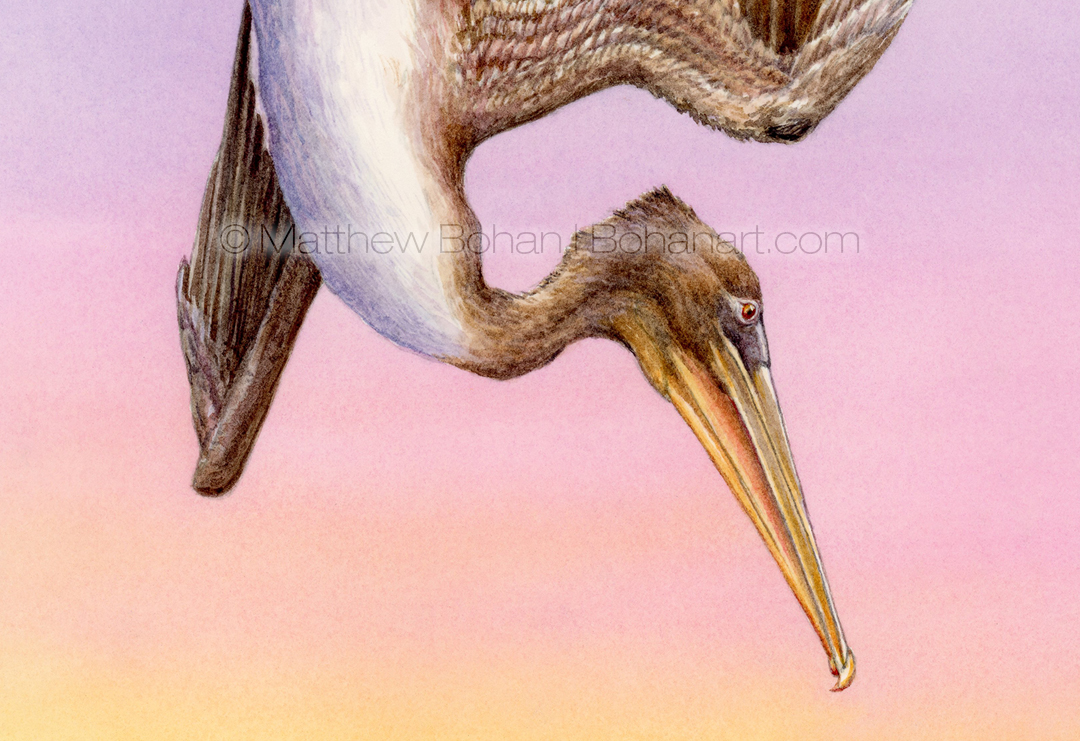
After a bigger, more complicated, 9×24-inch watercolor painting of Fancy Goldfish, I was in the mood for a smaller, quicker option. After looking through some sketches, I settled on this diving immature Brown Pelican. I took my reference images on a photography trip to Florida with my brother Ted. I think we have a thousand near-duplicate frames, as we were often shooting right next to each other. One place that gets a high yield of flying birds is the Sanibel Fishing pier near the Pt. Ybel Lighthouse. In addition to plenty of great wading birds, we were treated to many diving Brown Pelicans, as well as various terns and gulls. While the poor fish were being harvested from above by the birds, they were being chased to the surface by several dolphins below. Some days there is no safe place to hide, I guess! Though unlucky for the fish, it made for some great photos.
My shots were taken mid-afternoon and had pretty harsh lighting, a blue sky background and some blurred-out hotels from across the Sanibel causeway. While I liked the pose of the bird, the background pretty much destroyed the overall image. I thought warming up the sky with some sunset colors would work well with the browns of the bird. Unfortunately, the brown-against-blue combo made the bird look a bit sickly, with more of a green bias to the grey browns. I did a quick test in Photoshop of the colors I was considering before investing in the watercolor. Although the washes go down pretty quickly, frisketing the bird takes a bit of time, and I didn’t want to waste time or paper if the idea wasn’t going to work. In the end I was really happy with the background reinvention.
My wife has a high school friend who was a syndicated cartoonist with a ton of funny content. He penned At The Zü for a number of years. A favorite strip of mine had two animals looking at a sunset talking about how beautiful the colors were. After a pause one said to the other something along the lines of, “Yeah, but if you put those same colors on a T-shirt, people would say it was tacky!” I’m sure his wording was better, but you get the idea. There is a lot of truth to that!
Please contact me if you’re interested in buying the original or a print of this painting. Some of my work is also available for licensing.