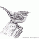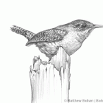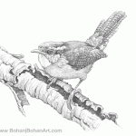
It took me a while to finally see a Winter Wren. I found my first one back in the mid-90s at the Celery Farm Preserve in northern Bergen County, New Jersey. I actually had a lot of life birds at that location because I was really getting into birding and went there almost every day.
Identifying a bird as a wren is pretty easy, but knowing which wren can be a bit more confusing as a beginning birder. Winter Wrens are tiny and seem to barely have wings or a tail. At times, they look almost spherical, like a Pokémon character. In addition to a pronounced lighter eyebrow stripe and other physical attributes, they kindly have some behaviors that set them apart. Most of the times I’ve seen Winter Wrens, they’ve been low to the ground and scurrying about like a mouse. Despite their tiny size, their vocalizations let off quite a racket.
One of my favorite places to see Winter Wrens is Maumee Bay State Park in northwestern Ohio. Almost every year that we’ve taken a family trip there for fall migration, we’ve gotten a good yield of birds. On a few occasions, we’ve timed things just right and seen crazy numbers of Winter Wrens.
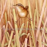
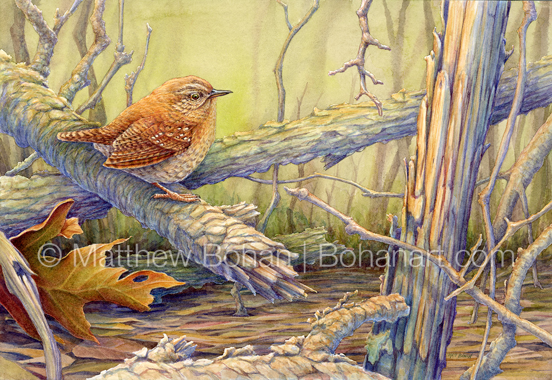
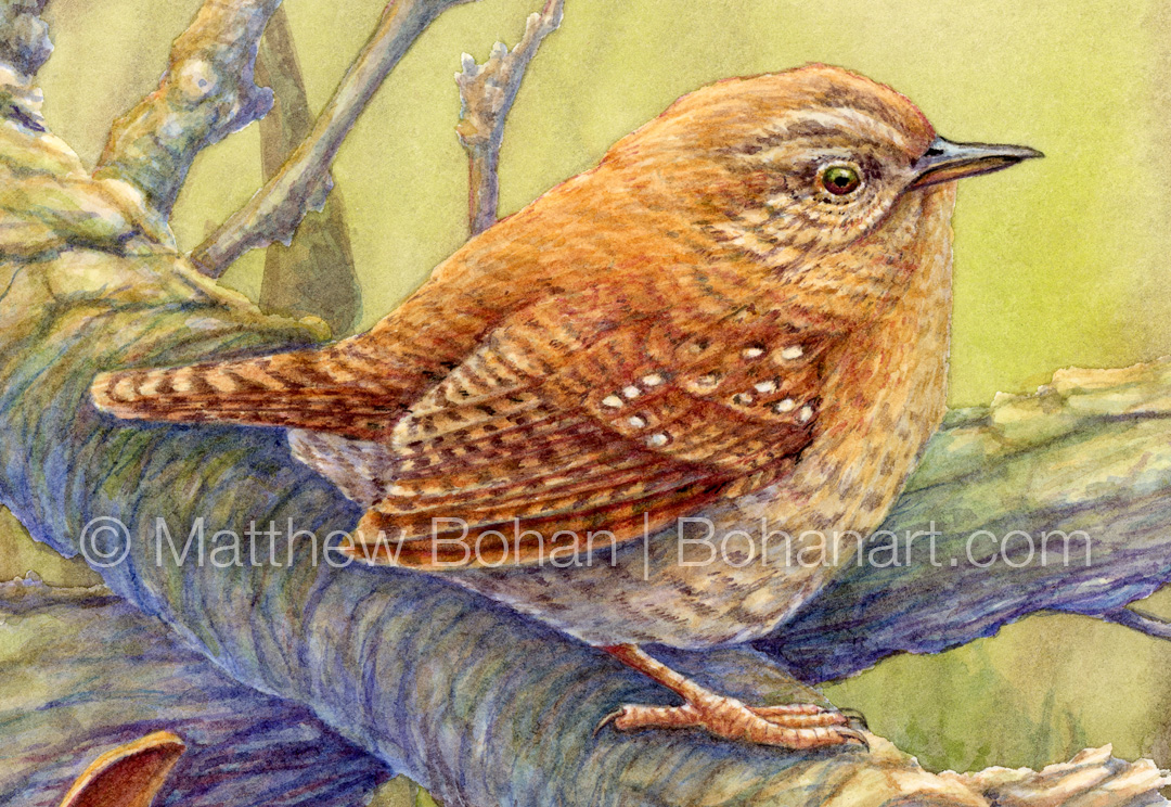
This painting is based on photos I took in Grand Ledge, Michigan, in the fall of 2025. Some movement caught my eye and there was a Winter Wren mousing about being followed by a mink! This went on for a good 5–7 minutes, allowing me to get some photos, but the two were never in the same frame… oh well! Maybe that was safer for the wren? Anyhow, it was really amazing.
My wren shots were a bit sub-par with a lot of tangled branches and a not-so-great focus, but it seemed like a neat moment to paint. I re-imagined the scene a lot, adding, removing and moving branches to improve the composition. I also changed up the lighting, moving away from the overcast “blah” and bringing in a lot of color. Specifically, I introduced more warm orange tones to the branches and tangles so the bird and oak leaf weren’t as visually isolated. I used color complements for shading, with bragged up blues and purples.
In recent years I’ve been throwing away a lot of “realism” and have been playing more with color, loosening up many portions of my paintings and letting washes and brushwork suggest more. I’ve been spending less time looking at photo references and more time thinking about color. I’ve considered what might work well with what is on the page, rather than what I saw the day I took the photos. I think that things end up looking more lifelike and energetic, yet less “photographic.” Given all the AI “art,” maybe seeing some brushstrokes isn’t such a bad thing!